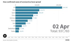
 We have found several sites to have accurate and informative coverage of the coronavirus. BBC New has a beautiful chart that shows the progression of the coronavirus from January 22, 2020 to the current date. You can watch as the countries move around based on the number of confirmed cases. Watch as the United States makes its entrance and then proceeds to the number one position.

The Washington Post has excellent maps that let you see at a glance just where the outbreak is exploding. You can click on an individual country or state to get the confirmed cases and death. At the state level, you can see which counties in the state have been affected. The Washington Post also has charts that show the number of confirmed cases in each country along with the daily increase.
Next
Surviving the Covid-19 (Coronavirus)
What to do if you think you have been exposed to Covid-19 (Coronavirus)

